Combatting Global Inventory Shortages
Reducing bounce rates and increasing conversions by improving the buying options for cyclists.
TIMELINE
4 weeks / Jun-Jul 2021
MY ROLE
UX/UI, Research, Interviews, Synthesis, Wireframing, Prototyping, Testing, Branding
*Self-started project
TOOLS
Sketch, Adobe XD, Miro, Photoshop, Illustrator
About Jalini Cycles
Jalini Cycles has grown to become the largest online retailer for high-end bikes, bike parts, and cycling gear. The majority of their customers are 18-34, high-income earners, predominantly male (72%), have extremely high standards, and take biking very seriously. Professional cyclists spend a lot of money on this investment so they are very picky and do a lot of research. Jalini Cycles has managed to thrive in this demanding market because it was founded by expert cyclists with a passion for the best of the best.
The “Original” Challenge
Website usability issues were crippling Jalini’s conversion rates from browse-to-checkout. Data showed that on average, 50% of users typically viewed 7 items before exiting the site without moving anything into the cart. It also revealed that 70% of users who moved an item into their cart never completed the purchase. Based on this data, Jalini’s Product Manager proposed two solutions to explore: adding a compare product feature and offering a guest checkout option (must capture email).
Problem
Poor user flows are negatively impacting sales.Goal
Increase conversion rates from browse-to-checkout.Challenges
– Having undefined deliverables
– Unexpected gaps in the economy
– Tight time constraints
PHASE 1
Discovery
1.0 – Developing a Plan
I needed to be honest with the stakeholders (and myself) about what was possible within the 90-hour timeline. To achieve this, I created a project plan outlining all the phases, deliverables, and design rationale. The approved plan was used throughout the 4-week Agile project to:
keep the project on track
control project scope
manage expectations
define weekly deliverables
SECONDARY RESEARCH
2.1 – Competitor Analysis
I intentionally begin every design project with competitor analysis because it’s an effective way to establish context quickly. As it relates to this project, browse-to-checkout user flows were my primary focus. I spent 3 hours familiarizing myself with common UI patterns in the bicycle e-commerce sector. Following my analysis, I compiled an in-depth review of the three most notable examples: trekbikes.com, competitivecyclist.com, twohubs.com.
My competitor analysis also included usability issues which fell outside the scope of my focus. I often include these insights because they tend to shed light on discoveries made throughout the process. Below are a few key insights which impacted the project later on:
there were a lot out-of-stock products weren’t labeled or identified in any way
too many sites felt like a blog site instead of an e-commerce store
product spec listings were clunky and frustrating to use
flashy UI was more frustrating than functional
SECONDARY RESEARCH
2.2 – Market Research
I had seen how competitors reacted to their respective markets. Now, it was time to familiarize myself with how the market worked. My primary goal in the beginning was to learn about the purchasing habits of high-end cyclists. I wanted to understand what motivated them, how they looked for products, why they purchased said products, and what market trends appealed to them most.
It didn’t take long for me to realize however, there was a larger, more menacing challenge lurking behind the scenes: global inventory shortages.

The original prompt did not account for inventory shortages because it was written (by Springboard) before the Covid-19 pandemic. Since the latest industry estimates project it will be 2023 before inventory gets back to normal levels, I decided to adjust the challenge to accurately reflect the current market.
REVISED CHALLENGE:
Find a way to increase conversions despite massive global inventory shortages.
Solution:
Make the out-of-stock experience actionable by giving users the ability to pre-order items with accurate ship dates, and enticing early-bird discounts.
Goal:
Improved buying options will increase conversion rates.
PRIMARY RESEARCH
3.1 – Conducting Interviews
Talking with Cyclists
I interviewed 4 competitive cyclists to better understand what their needs and goals were. We discussed where they shopped, how they shopped, and identified critical pain points within their browse-to-checkout journeys.
Talking with Businesses
I wanted to know if providing accurate ship dates (for pre-ordered items) was logistically possible. John Myers, owner of CinCityCycles, has over 25+ years of experience in the cycling industry, and was kind enough to speak with me about this subject. John explained the proposed solution was 100% possible because manufacturers schedule shipments far in advance. To account for any shipping delays, John recommended padding the advertised ship dates within a 2-4 week window.

Photo of John working on a customer’s bike following our interview at Spun Bicycles (another local bike shop in the area). John is friends with the owners and was helping them out for the day.
RESEARCH SYNTHESIS
4.1 – Synthesizing the Data
Affinity Mapping
User Persona
User Stories
The 4th affinity map yielded the greatest insights because it revealed critical roadblocks within the purchasing cycle.
The most common frustrations users encountered while shopping for bikes online were:
ineffective homepages that were confusing, hard to navigate, or provided too much irrelevant information
not showing when items are out of stock (the majority of online bike stores wouldn’t tell users a product was out of stock until they had reached the checkout)
specs were listed poorly, were hard to find, or didn’t provide all the information they were looking for
These roadblocks were used to determine the Minimal Viable Product (MVP). It also debunked the need for a compare products feature, as was suggested by Jalini’s product manager. All of the interviewees were familiar with this feature but none of them used it or found it helpful. This is why I decided to remove it from the docket moving forward.
“I never purchase a bike without doing research. I’ll spend weeks watching videos on Youtube and reading reviews before I decide what to buy.”
At this point in the project, I had developed a clear understanding of who the target user was. Unsurprisingly, my discovery closely resembled the profile Jalini’s Product Manager had provided. The next step involved tying everything together into one comprehensive document – the primary persona.
I then created a series of user stories modeling the routes Abdur would take to achieve his primary goal – purchasing a new bike. The three user epics I chose to focus on were:
Browsing
Looking at a product
Checking out
I intentionally excluded the routes Abdur takes while researching bikes beforehand because the bulk of that work is done outside of Jalini’s website.
PHASE 2
User Flows & Wireframes
5.1 – User Flows
Using what I had learned from Abdur’s user stories, I began designing the red routes he would take to accomplish his goals. I managed the project’s scope by focusing only on the most essential red routes: browsing, viewing a product, checking out. User flows were an essential part of the project because they gave me an opportunity to address issues within the information architecture before anything had been designed. This improved workflows for several reasons:
it served as a blueprint for the user interface
it sped up the design process
it ensured design solutions were user-focused and aligned with business goals
6.1 – Sketching the Solution
I’m a firm believer in “pencils before pixels”. In other words, sketching helps me work through abstract ideas because I’m not distracted by tiny details like font size or spacing. I gave myself one hour to sketch three interfaces (20-minutes for each red route). The goal of this exercise was to familiarize myself with the space I was designing for.
Playing with the user interface at this level gave me the freedom to explore a number of potential solutions. For the most part, a large majority of those solutions were adopted in later design phases:
the main navigation structure
the home page layout
the product filtering component
the consolidated checkout screen
6.2 – Wireframing the Red Routes
Converting sketches into a working prototype takes time. To expedite the process, I purchased an e-commerce wireframe kit. All of the design elements I used were customized to align with the target user’s goals and Jalini’s business needs. This was a design challenge because user needs and business goals frequently contradict one another. I resolved this by ranking which objectives were most important:
User goals took priority because a positive user experience was essential for retaining and attracting new customers. In other words, a happy customer base is the key for increasing conversions.
Business needs were secondary and nested within the user-focused flow. I used this approach to identify where solutions could have the greatest impact without defacing the users’ experience.
Final Wireframes
PHASE 3
Lo-Fi User Testing
7.1 – Test Preparation
I carefully developed a 9-question script to ensure the tests were as consistent as possible. The prompts were designed to have testers evaluate the following areas:
the red routes – user flows
ease-of-use – usability
page layout – information architecture
pre-ordering – determining if the solution was appealing, clear and actionable
8.1 – User Testing
In total, I recruited 5 participants for the first round of user testing. The tests were conducted remotely via Zoom and lasted 20-30 minutes. I began each test with an introduction, a brief overview, and then sent the participants a link to the working prototype. Participants shared their screens and spoke aloud while they completed 9 scenarios/prompts. All participants were given 9 identical scenarios/prompts with three additional follow up questions. After completing the test, every participant was given the opportunity to ask questions, or openly discuss their experience.
9.1 – Synthesizing the Results
The feedback I received was overwhelmingly positive, but it revealed some critical issues to address. I kept the project on track by generating a test report outlining everything I had discovered. Issues were assessed, tallied, and then ranked by varying levels of priority. Priorities were chosen based on the frequency of occurrences and how they related to the Abdur’s goals.
PHASE 4
High Fidelity Designs
10.1 – Bringing the Concept to Life
I began this process by developing a light weight style guide to determine the basic building blocks of Jalini’s brand personality. A majority of the photography used in this style guide was sourced using my personal subscription with Envato Elements. The only imagery I wasn’t able to source from Envato Elements were the product photos. Due to time and budgetary constraints, I sourced these assets from Google Images.
The Style Guide
Over the next 5 days, I spent 20+ hours designing the first high fidelity prototype. The style guide and the prototype evolved in tandem throughout the process. During the build, I focused on solving primary issues identified in the first round of user testing:
sub-navigation issues within the checkout flow
adding a confirmation screen after checkout
re-envisioning the buttons used on the product page
updating confusing verbiage
Timelapse of the Build
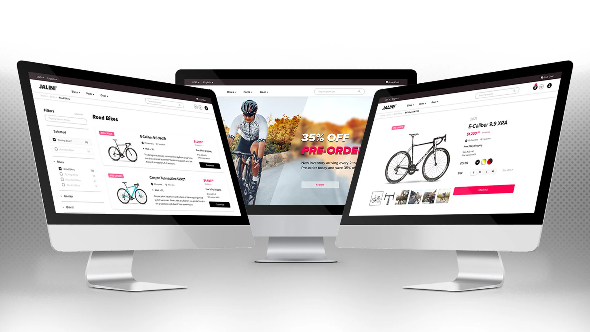
Homepage
Search Results
Product Page
Checkout
PHASE 5
Hi-Fi User Testing
11.1 – Testing the High Fidelity Prototype
I recruited another group of 5 participants for the second round of user testing. Like the first round, testing was conducted remotely via Zoom and lasted 30-40 minutes. All participants were given 6 identical scenarios/prompts with three additional follow up questions. After completing the test, every participant was given the opportunity to ask questions, or openly discuss their experience. A second test report was then generated to outline the newest discoveries.
PHASE 6
Final Design
12.1 – The Revised Prototype
I spent the last 9 hours of the project iterating on the final design by resolving issues identified in the second round of user testing. After tying up loose ends and adding final touches, the final prototype was ready for submission.
Product Demo
Outcomes & Lessons
Project Reflection
Outcomes
I was very pleased with the final result. Despite being thrown a massive curve ball in the beginning, the final product was delivered on time, met all of Jalini’s business requirements, and drastically improved the user experience.
“Online bike shops are notorious for not telling you if something is out of stock. Half the time I’ll place my order and receive an email an hour later saying the item wasn’t available. Even though most items are out of stock, I love having the option to at least preorder an item. I wish more bike shops conducted their business like Jalini Cycles.”
–User Testing Participant
Lessons Learned
Balancing business needs and user goals
This was challenging in the beginning because user needs and business goals frequently contradict one another. Ranking them proved effective because it created order and provided design constraints. These constraints enabled me to strategically approach the problem at hand, and equipped me with the tools needed to work through any contradictions.90-hours is not as long as it sounds
Because I personally love discovering as much information about a subject as I can, I ended up spending 10+ more hours than I had budgeted for in the discovery phase. The consequences were luckily manageable enough to keep the project moving along, and emphasized how short a 90-hour timeline truly was.Spend more time recruiting test participants
I want to dedicate more time towards participant recruitment in the future because I found myself cutting corners. I was so focused on discovery, designing, and testing that I forgot to give myself enough time to recruit the most ideal participants. While those who participated in my tests met the minimum requirements, I knew there were more ideal perspectives that weren’t being considered. Moving forward, I will give myself more time to source a wider array of testers.
Next Steps
This was a hypothetical project designed for academic training purposes. If this was a real-world project, the next step would be implementation. I would collaborate with Jalini’s web development, marketing, and sales teams to promote and launch the proposed solution. Following the launch, we would then conduct a 6-month analysis to determine if the solution had worked as intended. The analysis would involve:
heat mapping
google analytics
cross-comparisons
evaluating sales data
The 6-month window would provide enough data to determine how effective the solution was, if at all, and what areas would need further refinements.

