Extracting Hi-resolution Traffic Data with Artificial Intelligence
Designing dashboard interfaces for Traffic Controllers and Traffic Planners in a 4-week design internship.
TIMELINE
4 weeks / Aug-Sep 2021
MY ROLE
UX/UI, Research, Heuristic Analysis, User Flows, Wireframes, Lo-Fi Prototype, Hi-Fidelity Prototype, Style Guide
TOOLS
Figma, Google Docs, Illustrator, Photoshop
About Calculai
Calculai’s multidisciplinary team has years of experience helping complex enterprises and startups with strategy development, solution implementation, digital product development, and product roll-outs. Inspired by the power of artificial intelligence (AI), Calculai is pursuing a new and cutting-edge product line called, RealFlow. RealFlow generates hi-resolution traffic data from camera feeds and video files using proprietary AI technology. Until now, this type of work has only been possible through on-site analysis.
The Challenge
Our team was recruited through Springboard’s internship program to help Calculai design front-end dashboards for their 2-tiered product line, RealFlow:
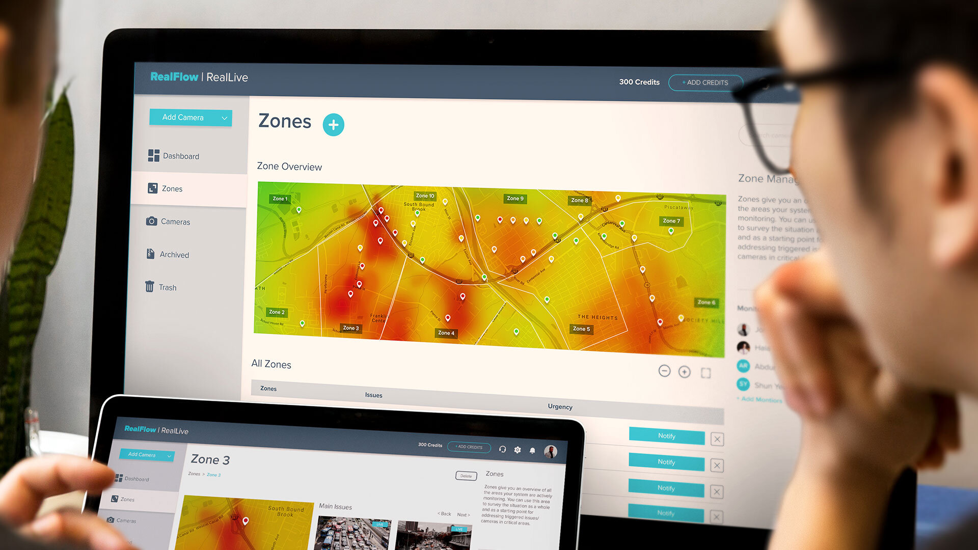
RealLive: Allows for real-time video analytics, detects traffic events, and sends alarms
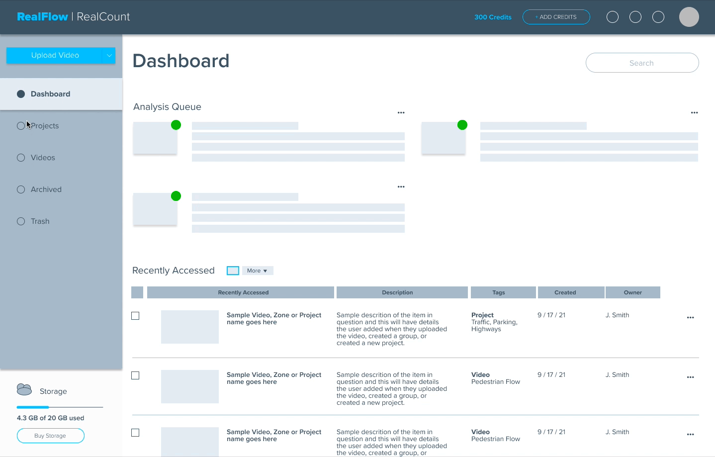
RealCount: Generates customizable analytical reports from pre-recorded traffic footage. All videos and reports are stored in RealFlow’s cloud
Goal
Convert complex needs and capabilities into a high-functioning user interfaceChallenges
– Starting from scratch with a 40-hour project timeline
– Producing as many iterations as possible
– Managing schedules in international time zones
– Overcoming gaps with user testing

INTRODUCTION
“We’re building the plane as we fly it.”
– Calculai Operator & Founder
[Day 1 - Kickoff Call]
My partner for this project was the incredibly gifted, Alice Sung.
WEEK 1
Discovery
Meeting the Client
On Day 1 of the project we scheduled a ‘kickoff call’ to meet the team, discuss logistics, assess their expectations, and determine where they were at in the development cycle. The call yielded 4 critical insights:
RealFlow was in the early development stage
The existing user interface was very minimal and being constructed in real time
RealFlow wasn’t a single stand-alone-product, it had two separate product lines: RealCount and RealLive.
The client wanted as many design iterations as possible
The 3rd and 4th insights significantly expanded the project’s scope because instead of designing one dashboard, we were building two. Both dashboards would require their own unique set of user flows, capabilities, use cases, and end goals.
“We want to see as many as iterations as possible.”
The client emphasized this point multiple times throughout our call on Day 1. We knew this would raise major issues later on. To prevent the project from stalling, our 2-person design team decided 2 things:
Use the rest of Week 1 for discovery
Submit the Project Plan on Day 5:
Our original plan was to meet with the client on Day 1, then submit a Project Plan later that evening. However, given the expanding scope, our unfamiliarity with the problem space, and the client’s request for multiple iterations, we decided more time was needed to build an accurate plan.
Understanding the Problem Space
Luckily, the Calculai team had done extensive research into their core users – Traffic Controllers and Traffic Planners. Our design team relied heavily on Calculai’s insights throughout the entire project. This expedited the discovery phase and gave us more time to study RealFlow’s primary competitor, GoodVision.

Heuristic Analysis
GoodVision was the only true competitor in this niche market. There were other startups pursuing similar platforms, but their products were too underdeveloped to produce actionable insights.
My partner and I invested over 6+ hours watching GoodVision’s product demos. This gave us a strong visual reference to base potential design solutions off of, and revealed 4 critical insights for design:
Information Architecture strategies and approaches
Common user flows (e.g. uploading videos, prepping footage for analysis, displaying analytical data)
Impactful UI patterns for complex dashboards
The criteria and steps needed to generate a deep analytical report
Was User Testing Even Possible?
We were nearing the end of Week 1 and still hadn’t addressed this pivotal question.
PROJECT GAP
📐
Client Needs
The client wanted at least 3 design iterations, but each one would take a week to develop.
🧑🏽💻
User Needs
To determine if the designs worked as intended, we needed very specific users to test each iteration. Each test however, would require a week to construct, schedule, conduct, and synthesize.
🔐
Time Constraints
We only had three weeks left, and our client’s network of test participants lived in time zones 6-12 hours ahead of our own. We simply weren’t in a position to do both.
SOLUTION
💡
Divide and Conquer:
To understand our solution, you first need to understand the context of our situation. We were the second design team Calculai had recruited through Springboard’s internship program. When our time was up, Calculai would be paired with a third Springboard design team. This being the case, we saw an opportunity to “divide and conquer”:
Alice and myself would focus on the actual build
The next Springboard team would inherit our work and focus on user testing
This solution wasn’t ideal. But, it ensured our client and their users’ needs would be met.
The Project Plan
Finally! We were in a position to provide our client (and ourselves) with a realistic Project Plan. Even though we submitted this on Day 5, our efforts over the past 4 days were included to show our team’s process. The client happily approved our plan and liked the solution we developed for user testing.
WEEK 2
Sketching the First Iteration
Mapping User Flows
User flows allowed us to work through usability issues upfront, identify critical screens, and develop an initial blueprint for the design. Next, we used our flows to define the Minimal Viable Product (MVP).
There had to be an onboarding flow for new RealCount users so they could try the program for free
RealCount needed to upload video files, have an organization system for file storage, a screen for dictating the focus of an analysis report, and a screen dedicated to data visualization for reports
RealLive needed a dashboard that provided an overview of all active cameras, a clever way of organizing cameras into sections/zones, and a screen for setting up connections to live camera feeds

Sketching the Interface
We began translating our discoveries into a workable interface using the user flows as our guide. Sketching was so important because it allowed us to quickly work through our ideas and align on crucial details such as:
the dashboard’s core structure
information architecture
primary and secondary navigation
organizing key features and files
This stage saved time in the long run because it united us, and ensured we were working towards the same goal.
Figma + Time = Wireframes
Feeling energized, refreshed, and aligned, our team began converting our sketches into low fidelity wireframes. The primary goal was to test wether our sketched solutions were feasible. Sketches sometimes look great on paper but, when they’re converted to pixels, new problems can arise.
Despite a few minor issues, the wireframes yielded 2 promising interfaces. Moreover, we were only on Day 2 of Week 2. We decided to take advantage of the extra time we had and began pushing the design into mid-fidelity.
Transitioning to Mid-Fidelity
It was okay for us to move into this stage because it was mostly cosmetic. No significant changes were made to the information architecture, navigation, layout, or core structure. Our main concern was that the lo-fi rendering wouldn’t look “real enough” for our client. Sometimes these situations can stall a project or lead it down a path that isn’t in anyone’s best interest. Alice and myself have personally experienced these situations and decided to trust our gut instincts. We were confident moving into mid-fidelity would keep the project on track and yield stronger feedback from the client.

Fast Account Setup
We removed unnecessary steps making the process faster and more upfront about pricing plans.
Streamlined Navigation
We designed the navigation to be as fluid and convenient as possible. No matter where a user was within the platform, they could effortlessly jump from one area to another.

Giving Users More Way to Organize Their Assets
Users can upload or connect videos on any screen at any time. It was important to position this primary feature as close to the user a possible. Additionally, the projects tab (for RealCount) and zones tab (RealLive) make storing, grouping, and accessing cameras or video files a breeze.
All Mid-Fidelity Screens

Presenting the 1st Demo
Our client wasn’t able to meet on Friday so we presented the first product demo to his lead developer. The recorded meeting was then sent to our client so he could provide feedback over the weekend. The first round of feedback was sent via slack and was fairly brief. The client was very pleased with our work and highlighted a couple minor issues:
Certain fields for uploading footage and adding cameras were either missing, incorrect, or could be consolidated
The project and zone tabs seemed promising, but there was grey area to work through
Certain verbiage was confusing and would need tweeking
There were typos throughout the first product demo
There were questions about some of the steps used to create an account
My partner and I were excited to hear the project was moving in the right direction. However, most of the feedback we received required a follow-up call before we could begin the next iteration. We notified the client and asked if we could meet early next week.
This is when major scheduling issues arose.
WEEK 3
The Second Iteration
Working Through Setbacks
To make a long story short, Week 3 was effectively a bust. It wasn’t anyone’s fault at the end of the day. It was just a combination of ultra busy schedules 6+ hours apart trying to find a mutually beneficial time to meet. As a result, our next follow up call didn’t occur until late Thursday evening.
Our team wasn’t going to be able to deliver the 3 iterations we had been feverishly working to achieve. But that’s okay. That’s life. Sometimes things don’t go the way you had planned.
Both parties agreed the next best thing for us to do was discuss the final deliverables. My partner and I were responsible for delivering the following:
Updating the first iteration with the feedback from Thursday’s call, and converting it to a high fidelity prototype.
Developing a light style guide that covered brand colors, typography, UI assets, and layout.
The Figma file for the style guide and high fidelity prototype
WEEK 4
Project Handoff
Submitting the Final Deliverables
Week 4 was bittersweet. We were happy to have been apart of something so cutting edge, but the conclusion felt a little hollow. Despite the less than picture-perfect ending, my partner and I were proud of the work we achieved. This project was demanding, stressful, and complicated. However, both of us were grateful for the opportunity to work with an organization trying to use technology for good. Technology that improves lives, and will hopefully one day make city streets safer for everyone on the road.
Style Guide
RealCount Product Demo
RealLive Product Demo
Outcomes & Lessons
Project Reflection
Outcomes
WOW! What a ride! This project had it all. It was cutting edge, an entirely new problem space (for me and my partner), was fraught with design challenges, and forced us both to work in an environment where international time zones impacted workflows.
I would’ve loved to conclude this case study with a glowing tale of triumph and success. But, as you now know, things didn’t quite pan out that way. And you know what, I’m okay with that. My 8+ years in the design field have re-shaped how I perceive success. Success for me is about doing 3 things:
Always do what you can…
…with what you have…
…where you are.
If you truly follow through with these 3 things, success is just a matter of perspective.
My partner and I are very proud of the work we delivered. We believe our final deliverables will empower the Calculai team to continue pursuing the RealFlow product line with confidence. Who knows, maybe one day we’ll hear about them in the news because their technology is saving lives. How cool would that be?
Lessons Learned
Balancing business needs and user goals
This was the most challenging balancing act I’ve dealt with so far. The idea of sacrificing user testing for the sake of churning out design iterations raised serious ethical questions for me as a UX/UI designer. Despite this gap, I stand by our proposed solution because it acknowledged the problem and found a workable solution.40-hours can only achieve so much
I don’t know if it’s my ambitions or my love for design, but I always think I have more time than I actually do. This project reminded me that time isn’t flexible. You can’t magically extend deadlines because you need more time. Moving forward, I want to be more vocal about when I think there isn’t enough time. I should raise my concerns to ensure both my clients and myself aren’t placed in impossible situations.Prioritize. Communicate. Execute.
Alice was an exceptional design partner. We were able to navigate this challenging project because we constantly worked together. Our ability to prioritize requests, communicate plans, and execute design solutions enabled us to work effectively and stay united throughout the entire project.
Next Steps
Continue loving life, and keep designing. ✌🏼