Helping At-Home-Chefs Cook with Confidence
Enhancing how people cook and connect with fellow food lovers through a 5-day design sprint.
COMPANY
Self-started Project
TIMELINE
5 days / June 2021
ROLE
UX/UI, Research Synthesis, Sketching, Prototyping, Testing
TOOLS
Pen & Paper, Adobe XD, Miro
About SAVR
SAVR, a fictional startup created by Springboard, wanted to make it easier for people to follow new recipes, and cook great meals at home. A majority of their success can be attributed to the vibrant and highly-active community they’ve fostered over the years. After completing a recipe, users give back to the community by writing reviews and rating their experience. Even though SAVR’s user-base is fairly broad, with skillsets ranging from basic to advanced, they’re united by two distinct traits: a passion for cooking and a willingness to learn.
The Challenge
Following a recent spike in negative reviews about lengthier, more complex recipes, SAVR conducted a series of user interviews to help identify why. The results of their findings outlined the foundations of the problem space:
Problem
Cooking lengthier and more complex recipes feels chaotic and stressful.Goal
Make the instructions easier to follow so users can successfully cook these recipes while also feeling satisfied with the outcome.Constraints
– Recipes must be formatted as lists
– Solutions must be designed for mobile
– Focus on solving problems once users start cooking
THE PLAN
A Solo 5-Day Design Sprint
Project was structured using the Google Venture design sprint process:
DAY 1 – Map
DAY 2 – Sketch
DAY 3 – Decide
DAY 4 – Prototype
DAY 5 – Test
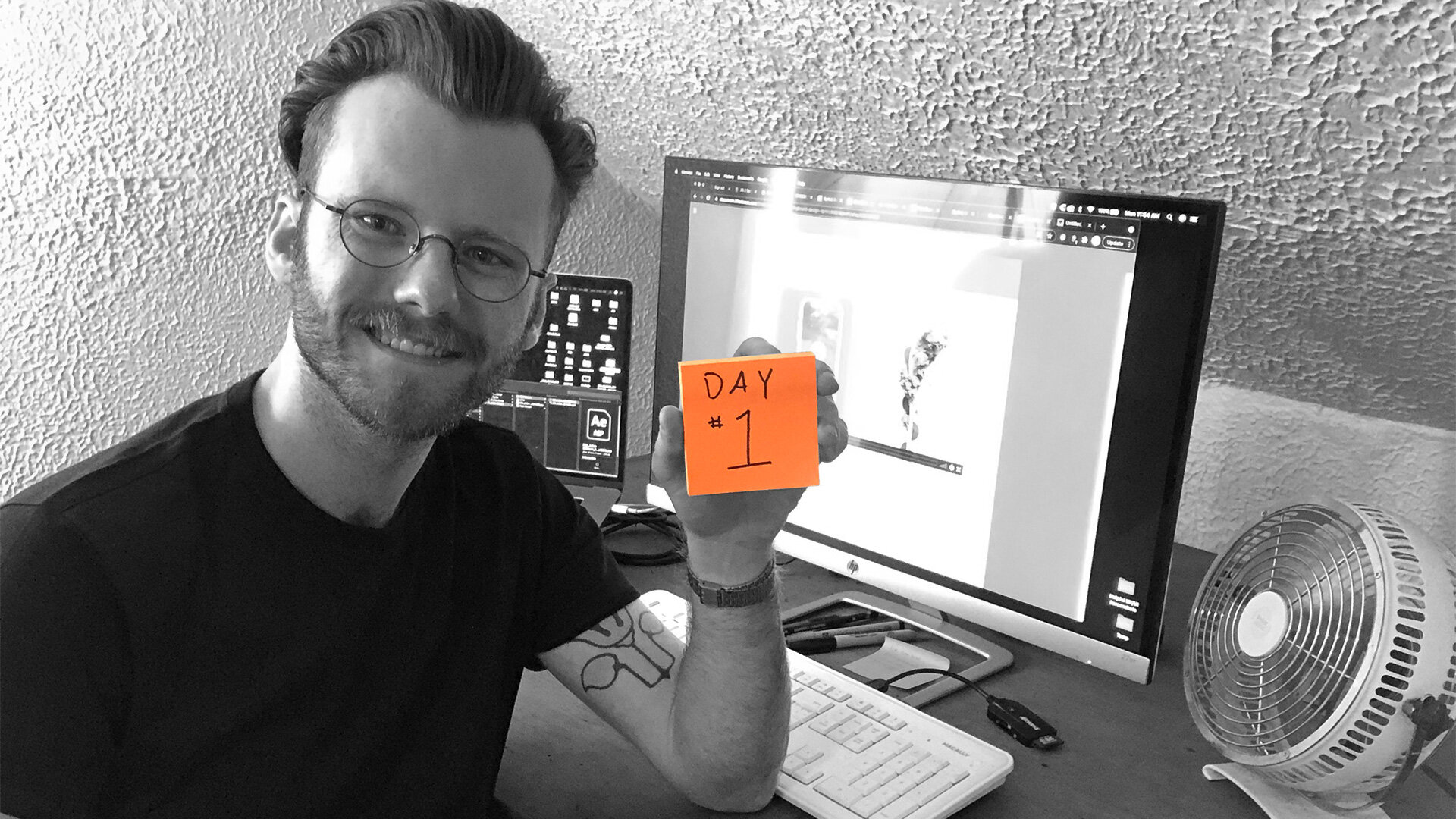
DAY 1
Mapping
Goals:
Develop insights and identify key pain points from the user interviews and user persona
Map several end-to-end user flows
Begin recruiting participants for user testing at the end of the week
.
Meeting the Target User
After familiarizing myself with SAVR’s research brief, I circled back to Nick, the primary user persona. This was a critical first step because it allowed me to approach the problem from the target user’s perspective. The following insights would help me determine which pain points were most critical later on:
Cooks 3 meals a week from scratch (on average)
Likes building new skills and strengthening existing ones by following recipes
Wants new recipes to be challenging and enjoyable – not stressful or chaotic
Gets frustrated when he feels unsure, doesn’t know what’s next, or feels disappointed with the outcome
Identifying the Pain Points
SAVR’s research team consolidated input from their user interviews into eight, all-encompassing quotes. For the sake of this case study, I’ve chosen four quotes to highlight the most critical user feedback.

“It’s fun! If I have time, I’m up for a challenge. There are some parts I don’t enjoy though…like emptying my cabinets because I don’t know what kitchenware I need…”
– Maria

“Sometimes I feel like steps are sprung on me…and that turns an enjoyable experience into a stressful one.”
– Anthony

“Timing everything together can be stressful for more complex recipes or meals.”
– Silvia

“I know the basic definitions…but a lot of times I see techniques that I am totally unclear on.”
– Sara
The 7 most common pain points I identified were:
Timing
Prep Work
Not knowing what kitchenware was needed
Order of Steps
Unfamiliar with techniques
Feeling unsure about doing something right
Unsure about an ingredient
Next, I used affinity mapping to determine which of the 7 pain points were absolutely essential to address. This process ensured I was staying true to the user and revealed the top three issues:
feeling unsure
not knowing what’s needed
and unexpected (or inefficient) steps in the recipe
Then, I created a bare-bone user story map to help unpack potential features for the second stage: mapping end-to-end user flows.
Mapping User-Focused Solutions
I dedicated the remainder first day to sketching 3 end-to-end user flows. This process allowed me to work through some of my initial ideas.
As I was sketching, I recalled how some of the interviewees based their failed or unmet expectations on their assessment of the recipe description. This was a major breakthrough because it meant the recipe section wasn’t providing users with an adequate overview of what was to come. I could potentially address this pain point by highlighting the kitchenware users would need, breaking down the steps involved, and emphasizing any timing challenges users may need to plan for. These possibilities wouldn’t solve the entire problem, but they would free up a lot of space to address issues in the cooking phase such as unexpected steps and unfamiliar techniques
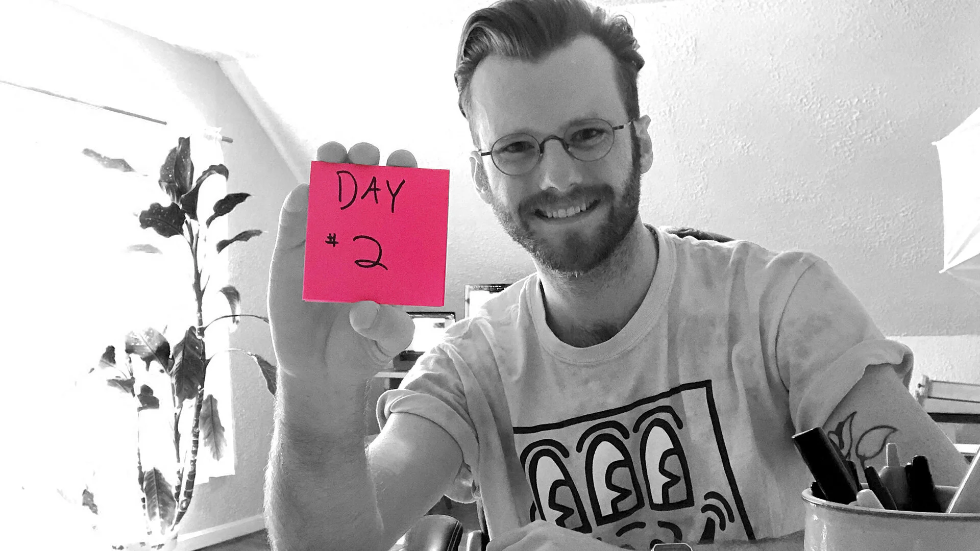
DAY 2
Sketching
Goals:
Conduct a solo lightning demo and analyze how competitors are solving similar problems
Use the “Crazy 8’s” method to sketch possible solutions for the most critical screens
Using the strongest option from the “Crazy 8’s”, create a solution sketch
.
Getting Inspired with Lightning Demos
The second day of the design sprint was dedicated to sketching. To kick things off, I conducted an hour-long lightning demo to analyze how Savr’s competitors have solved for similar design challenges. The three examples below inspired a ton of creative ways to help Nick reach his goals:
Epicurious.com had a “quick view” option which was an extremely powerful feature because it provided users with pertinent details upfront (e.g. kitchenware needed, special prep steps, how many advanced techniques there will be). There was a strong possibility this approach could help prevent users from feeling unsure later on.
Yummly cleverly organized pertinent information into a series of overlay buttons. This provided users with a cleaner interface and allowed Yummly to break the typical user flow into digestible segments. For example, most cooking apps provide recipes in a single, densely packed page. Yummly however, focused their users’ attention on one thing at a time.
Tasty improved the recipe experience by offering their users two viewing options: a list view and a step-by-step view. Unlike the list view, the step-by-step view provided visual aids for users to reference while they cooked. Users could easily toggle between the two views based on their preferences, or needs at that time. This solution could potentially improve SAVR’s cooking experience because it accommodated for a wide array of skillsets.
The Crazy 8’s
During the lightning demo phase I noticed a new UI pattern emerging within the online cooking sector. Instead of combining the entire recipe onto one page, competitors like Epicurious.com split the content into two pages: an overview page followed by the actual recipe page. Experimenting with new UI patterns was risky, but I was confident it would greatly improve Nick’s experience. I used the “Crazy 8’s” sketching technique to explore my 2-step strategy:
Onboarding users at the recipe overview:
This section was designed to empower SAVR’s users by informing them ahead of time about ingredients, necessary kitchenware, potential difficulties, and new techniques. If the solution worked as intended, it would greatly improve the cooking experience by protecting users from potentially stressful and chaotic situations.Inserting visuals into the recipe:
In theory, quick access to visual aids and descriptions could reduce feelings of uneasiness. The solution would involve designing two different views that users could easily toggle between. This solution was heavily influenced by discoveries made in the lightening demo phase.
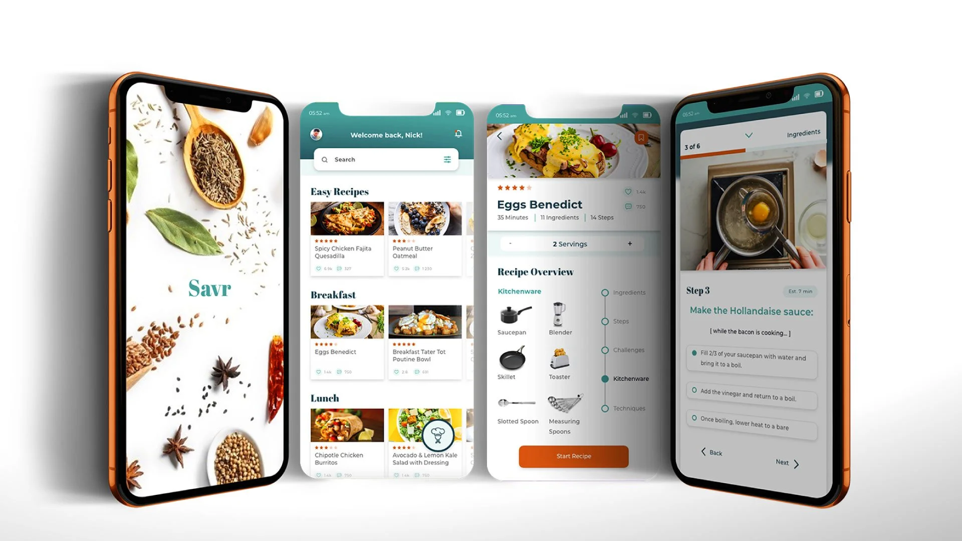
Critical Screens
(L) Recipe Overview | (R) Recipe Page
Sketching the Solution
Structured like a 3-part story board, solution sketching gave me the freedom to work through potential features, functions, and interactions. The recipe overview page proved to be the biggest design challenge for several reasons:
The interface needed to feel like an overview or else it could end up frustrating users accustomed to the single page model
There were a lot of details to cover and prioritize
The information architecture had to be intuitive, inviting, and accessible
The CTA couldn’t be ‘too actionable’ because it could prematurely pull users away from the recipe overview page
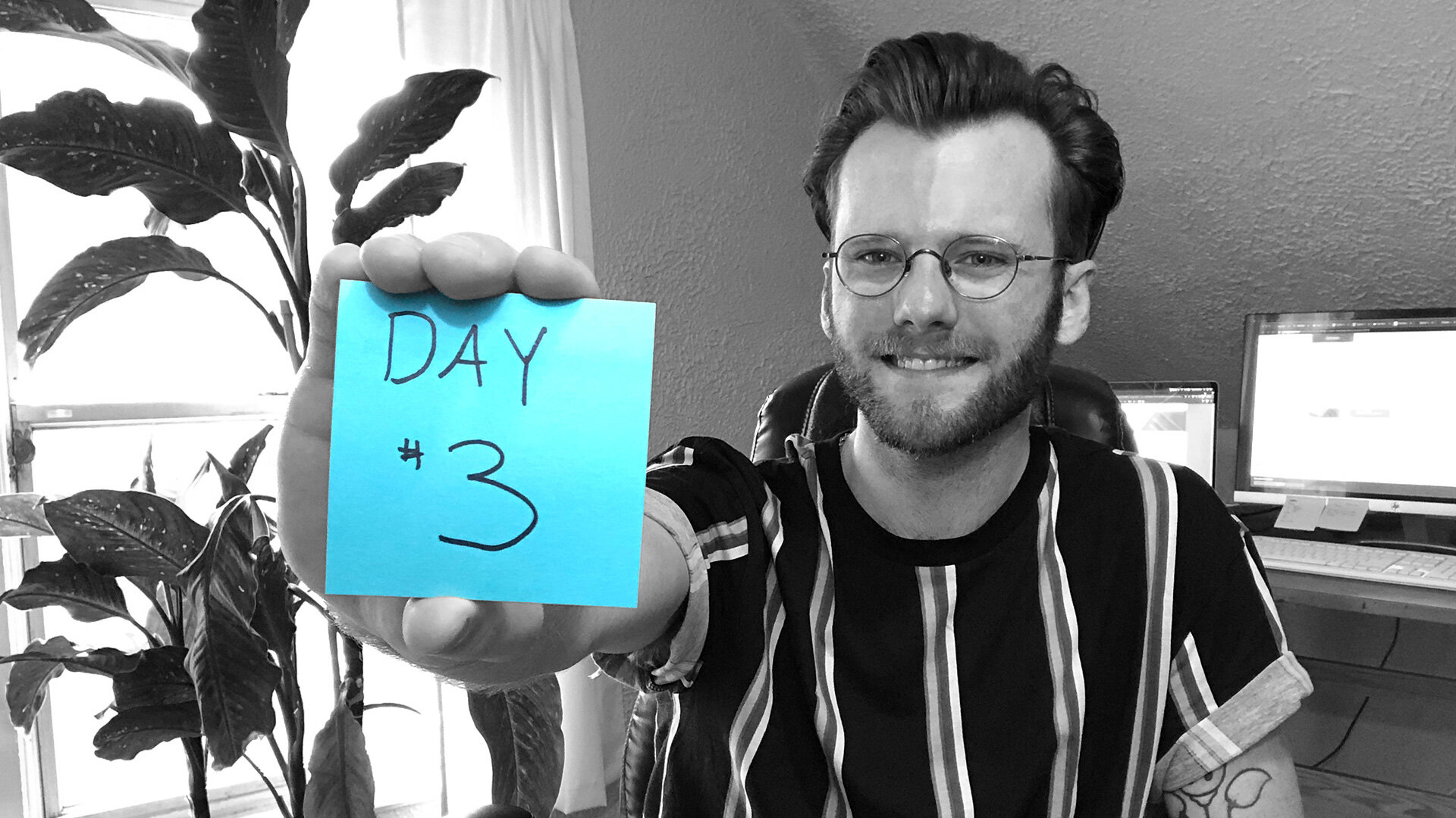
DAY 3
Deciding
Goals:
Decide which screens to use from Day 2
Storyboard the new path Nick would take to complete his goal using critical screens
Narrate each panel of the storyboard and annotate important transitions, functions and UI elements
.
Normally teams use day three to decide which solution to move forward with. Because this was a solo project, I took advantage of leftover time from day two to make my decisions. This proactive approach gave me the room needed to thoroughly sketch out the wireframes on day three.
Updating the User Flow
To make sure Nick’s path reflected the discoveries from day two, I re-mapped his journey and ensured everything was aligned correctly. This was extremely important because the user flow served as my foundation for the upcoming section.
I also used the updated map to determine how many unique screens were needed.
Storyboarding
My goal was to turn Nick’s journey into a visual story using the mapped flows (from earlier) as the plot. Each panel was organized chronologically and assigned tasks Nick would use to reach his goals. With the stage fully set, I began sketching the visual components. The final product was essentially a light-weight wireframe I would use for prototyping on day four.
After I was done sketching, I created fun “pointy hand” stickers indicating where Nick’s clicks would be.
The final annotated storyboard was pretty dense and these stickers made tracking Nick’s journey easier to follow.
Conducting a Pre-flight Test
I scanned the final sketches and built a crude prototype in Marvel to determine if the flow worked as intended. No users were recruited for this test. The goal was simply to determine what areas, if any, needed to be addressed in Day 4 – the prototyping phase. Despite the poor resolution and inconsistent lighting, no significant issues with the UI or the user flows were detected.
DAY 4
Prototyping
Goal:
Build a working prototype to test with users on Day 5

.
With the exception of the icons (sourced from a UI kit), I built the entire prototype from scratch in just 8 hours using Adobe XD.
Timelapse of the Build
High-Fidelity Screens
The blueprints I developed on day three expedited the overall design process. Even though the final build was a lot of work, I had a blast putting everything together.
Preparing for the User Tests
I used Marvel to quickly assemble a working prototype of the design solution. I chose to go with Marvel instead of Adobe XD because Marvel displays prototypes as if they were inside an actual device. It’s a small detail but, as I’ve learned over time, ‘context is key’.
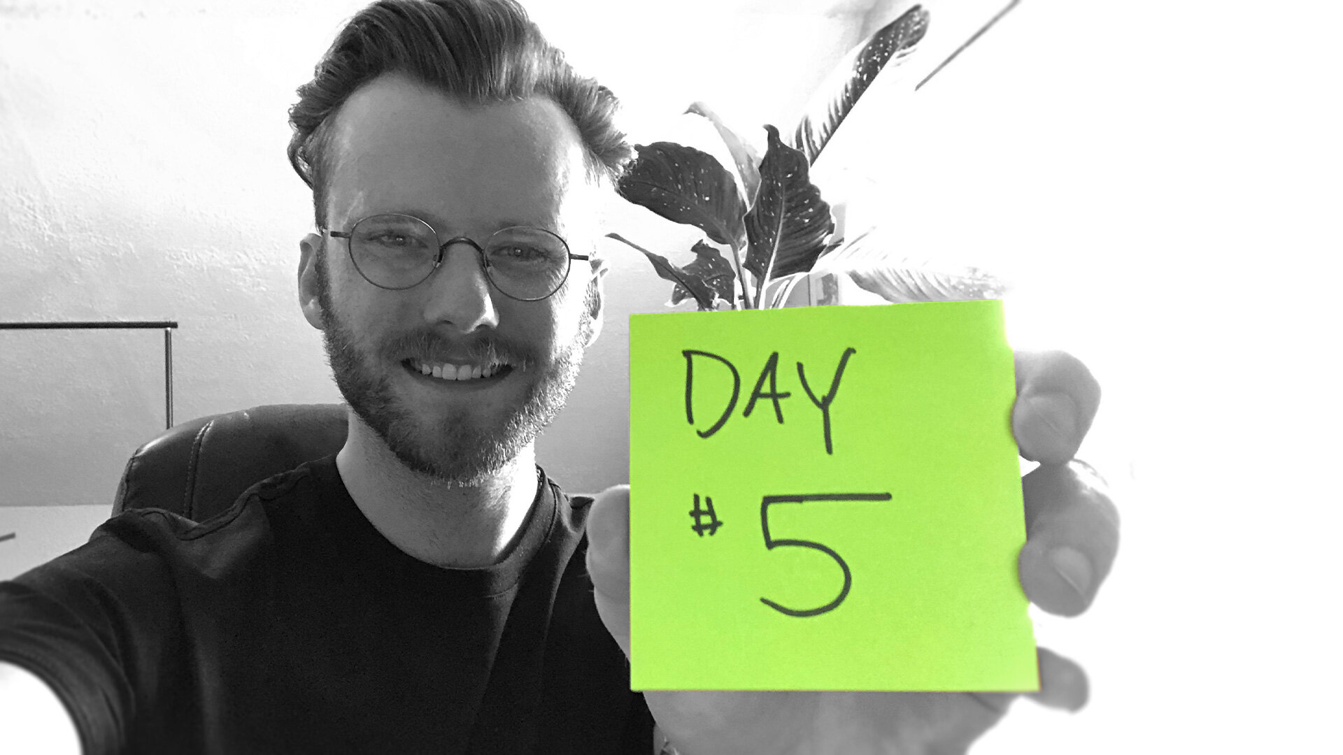
DAY 5
Testing
Goal:
Test the prototype with 5 users to determine if the design solutions are viable
.
Learning from User Feedback
Testing the prototype with users on day five helped me determine if the design solutions were viable. Throughout the day, I conducted five remote user tests via Zoom lasting about 15-30 minutes each. After completing the test, every participant was given the opportunity to ask questions, or openly discuss their experience.
Interpreting the Results
The feedback from all participants was overwhelmingly positive. Aside from minor personal preferences, all participants enjoyed the experience and were confident it would mitigate many of the pain points identified in the user persona: feelings of being unsure, not knowing if something was done correctly, issues with timing, and not knowing what to expect.
There were however three critical areas that would need to be addressed in future iterations. The priority for each was determined by the number of users who shared the same feedback:
The “Timer” caused anxiety
80% of participants immediately felt rushed when they noticed the timer on the recipe page. They felt as though it was timing them instead of how long something had been in the oven or on the stove. Speaking with several participants at the end of the tests revealed why the feedback had been negative. The main issue was the light-weight nature of this prototype. In short, I didn’t have the time to animate it properly so users could discover its true purpose.Reordering the Overview Sections
100% of participants found the recipe overview section informative, impactful, and easy to navigate. However, 60% of participants responded saying the order of the sections felt “off” and agreed that “kitchenware” should go under “ingredients”. This revealed an alternate IA structure that would better align with the users’ train of thought.Refine the Step-by-Step View
80% of participants felt the “step-by-step view” was hidden and 60% felt confused when it opened. The majority said it was confusing because it looked too similar to the previous view and they weren’t sure why it was there. This feedback would require more time to address before moving forward with implementation.
Outcomes & Lessons
Project Reflection
Outcomes
I was very pleased with the results of this design sprint. Despite its flaws, the final prototype successfully addressed critical pain points outlined in the user persona, and provided SAVR with a feasible solution to improve their users’ experience.
Lessons
Transitioning from a classic waterfall design project to a 5-day GV design sprint was a major shock. The hardest challenge I faced was by far the speed. Managing the project’s scope was absolutely essential for keeping me focused on the end goal – removing stress and chaos from the lives of SAVR’s users.

Keep exploring!