Making Car Repairs Worry-free
Providing drivers with a more transparent, efficient, and empowering car repair experience.
.
TIMELINE
16 Weeks / Feb-May 2021
MY ROLE
UX/UI, Research, Interviews, Prototyping, Testing
*Self-started project
TOOLS
Adobe XD, Illustrator, Photoshop, After Effects, Premiere, Miro, Marvel
About Varoom
Varoom provides customers with unprecedented access to a vast network of trusted service providers, fast online scheduling, transparent pricing and direct messaging capabilities. No matter who you are, what kind of vehicle you drive, or how much you know about cars, Varoom is there to keep you on the move, worry-free.
The Challenge
Develop an end-to-end mobile app that provides drivers with a more transparent, efficient, and empowering car repair experience.
Goals
– Reduce stress and anxiety levels
– Make it universally easy-to-use and accessible
– Give users more control over their experienceChallenges
– Persistent public paranoia
– Identifying the most critical pain points
– Solving for an extremely broad user base
– Scope creep
Discovery
The Problem Space
Understanding Public Perception
Most Americans have no idea what’s going on under the hood of their vehicle. Coupled with the fact that, compared to 1970, the number of licensed drivers in the United States has doubled to 210 million, it was clear why public paranoia over auto repair continued to plague motorists. As Audra Fordin explained in her article, “The Six Reasons Why People Feel Anxious about Auto Repair”, negative perceptions could be fueled by any of the following criteria:
a lack of automotive knowledge
financial constraints
lack of availability
previous bad experiences
negative stories
not fully understanding what’s being repaired
Providing a Powerful Experience
According to an article from the Harvard Business Review, addressing emotional triggers was the key providing a powerful customer experience. Their four-step strategy involved:
Identifying emotional triggers
Responding early to intense emotions
Enhancing customers’ control
Hiring the right people and prepare them for the role.
“Customers’ assessments of quality and value, buying decisions, and recommendations are all influenced by emotions (Harvard Business Review).”
Talking to Motorists
I published a 10-question survey to provide a face to the swaths of data, reports and journals I had been reading. The survey was designed to do two things:
Participant Screening – 2 questions
Ideal candidates only had to meet two criteria: they had to own a car they were financially responsible for and, in the last five years, they needed to have personally experienced at least one car repair journey. 37 motorists responded, ranging from their early 20’s to their late 60’s. After going through all their responses, I set up 5 interviews with the broadest range of candidates available to me.Quantitative Data – 8 questions
I wanted to know what commonalities, if any, there were between my respondents and the stats/perceptions I had read about. Additionally, I used this as an opportunity to gather quantitative data on subjects I wasn’t able to locate myself. The following discoveries provided the earliest foundations for identifying the target users, and influenced the questions I asked during my interviews.

60% of respondents ranked themselves between 1-2.
This corroborated my previous findings and seemed to directly relate to anxiety levels.

Foundations for the user persona:
39% said they call a family member or a friend
24% said they use a search engine
19% said they panic or pretend the problem doesn’t exist.
Synthesizing What I Learned
I used several affinity mapping techniques to help identify emotional triggers, negative patterns, and user goals.
STEP 1: Distillation
Distill the interviewees responses into 5 manageable categories:
Actions • Emotions • Likes • Dislikes • Additional Observations
STEP 2: Identifying Patterns
The next step was a challenge because my focus was too broad in the beginning. I was tracking too many things at once and my maps, though colorful and dazzling to look at, were fruitless. Feeling overwhelmed, I decided to focus on something simpler – “likes” and “dislikes”. The benefits of a narrowed focus weren’t obvious at the time, but in doing so, I was able to identify patterns and slowly work my way up to the big picture.
STEP 3: Building A Map
The need for a visual representation of their collective journey wasn’t fully recognized until I reached the end of Step 2. Simply put, if you want to identify where triggers and patterns occur, you need a map. I constructed the map by chronologically organizing the actions into groups based on their similarities. I refined the map even further by removing irrelevant edge cases. Having identified a surprising amount of overlap in the top three actions, I used tape to show how everything tied together. The finished map revealed a peculiar funnel shape I wasn’t expecting. This suggested users with different first-reactions are more common than originally expected.
STEP 4: Seeing the Big Picture
At the beginning of this process, I believed negative patterns were somehow more important than the positive ones. This perspective, as I came to realize, was flawed because it distracted me from seeing what was already working. I used this new realization to assess three things:
Were any positives & negatives correlated?
If they were, were there opportunities to leverage and reinforce the positives?
Where are the emotional triggers?
“The most annoying thing is waiting around for shops to call you back. After a while you start to wonder if they forgot about you. ”
–Interview Participant
The Target Audience
Ideation
Envisioning the Future
Converting Insights into Design Features
Insights from the user interviews and personas inspired a lot of ideas to work through. Sketching allowed me to process abstract concepts freely and to explore possible features, such as:
an easy-to-use selection process
a way to troubleshoot car troubles
using time slots for online scheduling
giving users a way to educate themselves about repairs
direct contact to service providers
transparent pricing
Mapping out “trust builders” • Exploring possible features • Fleshing out the direct messaging feature

Overcoming a Gap
I realized through sketching there was a major question I needed to answer: was I designing a B2C platform, a B2B platform, or was it a combination of both? A B2C model is the most direct way to have a positive impact on motorists. Providing them with key features like direct access to a verified network, direct messaging and online scheduling however, would require a B2B component. Without that, those features simply wouldn’t be possible. This created a major gap because time constraints and a lack of resources prevented me from being able to conduct a second discovery phase focused on auto repair businesses.
I overcame this gap by conducting a 1-day “research sprint”. I identified three competitors who currently operate on a combined B2B2C platform: Repair Pal, Your Mechanic, and Carcility. If I could find live examples of the features I was exploring on any one of their platforms, I could objectively prove what was possible and what wasn’t. I used this method to cross-reference every feature I explored to ensure my potential solutions were feasible. This solution was by no means ideal, but it enabled me to take an evidence-based leap over the gap I was facing and allowed the project to continue with confidence.
Mapping User Needs
I discovered how to approach complex features by breaking major needs into individual components. This was achieved by mapping only the features that users needed most into a series of user stories.
This process provided a rough blueprint for a Minimal Viable Product (MVP). The 6 critical features identified were:
Educational components
Diagnostic capabilities
Online scheduling
Direct messaging
Fast & itemized estimates
An easy-to-use service selection process
Mapping User Flows
Virtually all of the critical features were interwoven together. This meant I had to do two things:
Create user flows to establish the inner workings for each critical feature
Identify areas that can be improved, consolidated or removed to ensure the experience is as learnable, customizable and efficient as possible.
Even though some of the routes underwent changes later on, the structure was strong enough to carry me into the upcoming design phase.
Design
Building the Experience
Sketching the Red Routes
Sketching revealed early on how large of a project this was going to be. To avoid stalling the project, I decided to only focus on screens and scenarios that were absolutely essential. The screens I didn’t sketch were kept on a list which I later referred back to during the wireframing phase.
Onboarding
Scheduling a New Service Request
Scheduling • Price Estimates • Educational Components
Footer Menu Tabs
Wireframing the Red Routes
Now that I had a clearer sense of the scope of work, I was ready to begin wireframing the design.
Scheduling A New Service Request
Onboarding
Footer Menu Tabs
Search + Forum
Diagnostic Feature
I used insights from the user flows while I worked to improve several features, including:
Adding a license plate field for onboarding:
License plates are linked to the vehicle’s VIN number. This saves users from having to manually enter details about their car.
Combining the search field, service listing and diagnostic features into one central page:
This reduced the number of clicks needed to access primary features.
Refining the footer tab navigation:
These adjustments provided faster access to pre- and post-service needs while increasing platform learnability.
Adding more search feature capabilities to boost the educational component: These features would later be consolidated in the high-fidelity stage.
UX Wireframe Flows
I set out mapping new wireframe flows to ensure the improvements I made were in line with my users’ needs. I also wanted to make sure the platform was flexible and allowed for easy navigation throughout all stages of a user’s journey.
Bringing the Brand to Life
My vast experience as a graphic designer came in handy here but this was still a challenge – the branding had to be universally approachable, accessible, and welcoming. Below is the resulting 22-page style guide identifying Varoom’s mission/vision, personality, and brand attributes.
High-Fidelity Red Routes
Up to this point, I had been using placeholder copy to fill pages (e.g., lorem ipsum). Populating screens with contextually relevant body copy however, revealed two significant issues:
Search + Forum:
This feature, though well intended, pulled users away from the core feature. I solved this by adding an information button next to every service. This solution provided users with a more convenient and relevant way to learn without pulling them from their main objective.
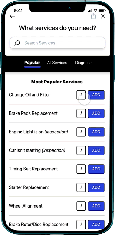
Services:
The list of all possible services was too long for the original format and the terminology was complicated. I accounted for this by splitting the “services” tab into two independent tabs: popular services and all services. Paired with the search feature, this adjustment provided users with more accessible ways to address their car repair needs.
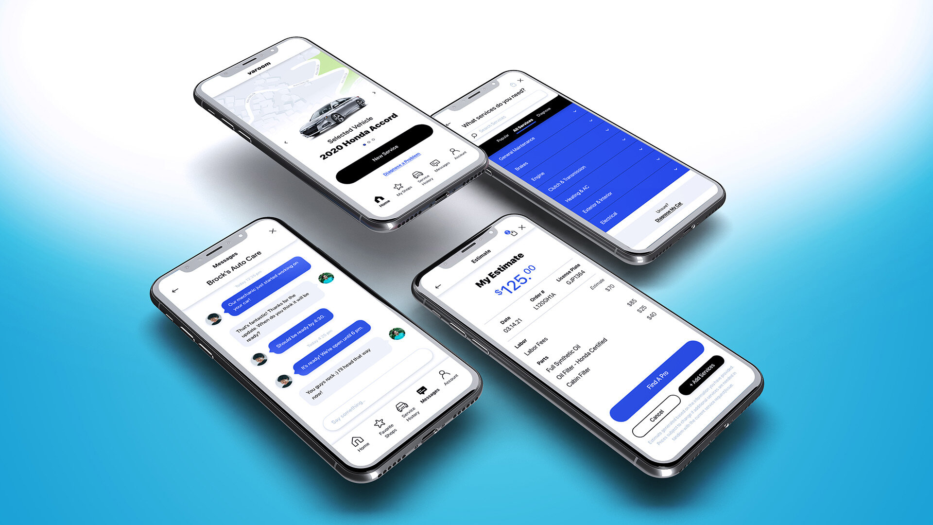
Scheduling a New Service Request Using “Popular Services” Route
“All Services” Route
“Info Tab” Route
Onboarding
“Service Search” Route
“Diagnostic Feature” Route
Menu Tabs
User Testing
The high-fidelity prototype had macro and micro interactions and was ready for testing. Over the course of 15 days, I conducted two rounds of usability tests with 10 participants. The first round was conducted remotely and the second round was conducted in-person. Based on user feedback, the most significant changes made were as follows:
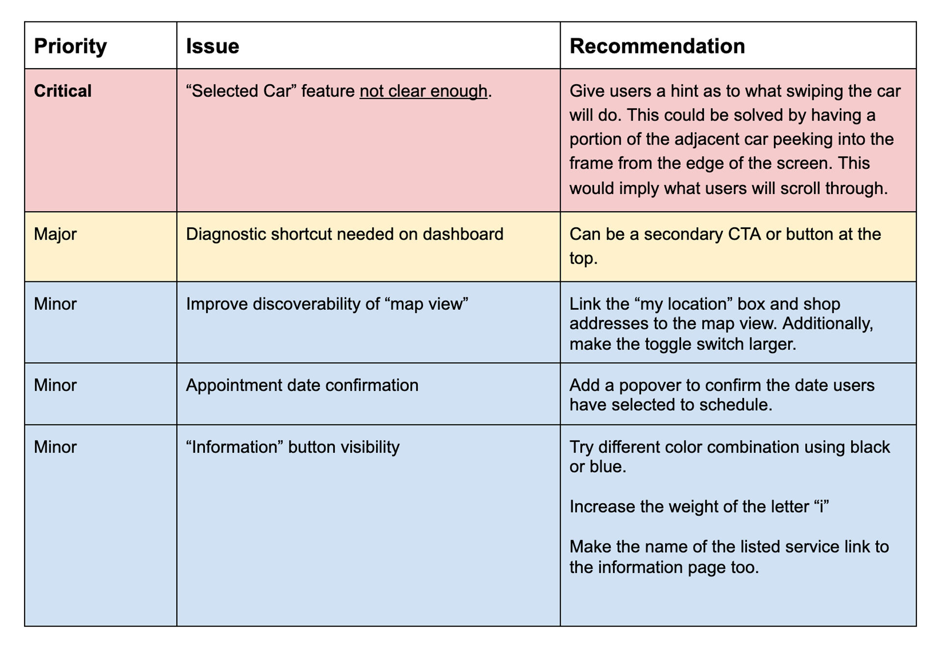
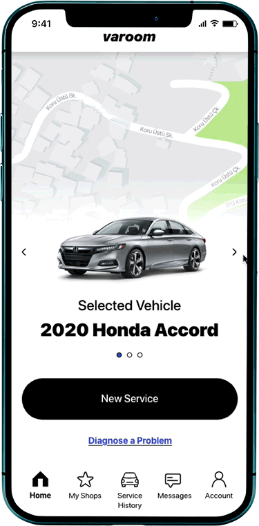
Refined Car Selection
60% of participants originally thought clicking or swiping the car would reveal more details or stats about the vehicle. This feature was adjusted and animated for the next round of testing. All participants in the second round of tests quickly discovered, understood, and greatly appreciated this feature.
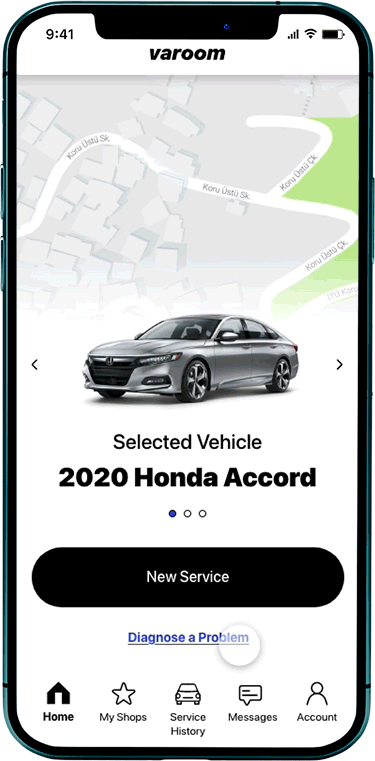
Adding a Diagnostic Shortcut
60% of participants (in the first group) felt the diagnostic capability was hard to find. Adding a linked shortcut below the main CTA proved effective. Zero participants in the second round of testing struggled with this scenario.
Improving Legibility of the Info Tab
The information button was hard to read for 40% of users so the colors were darkened to black. Zero users reported legibility issues in the second round of testing.
Product Demo
Outcomes & Lessons
Project Reflection
Outcomes
Varoom successfully delivered on its mission to provide motorists with a more transparent, efficient, and empowering car repair experience. Was the final product perfect? Of course not, nothing ever is. The true goal however, was to create positive change in the world by addressing a problem millions of motorists deal with every year. I believe Varoom has the potential to be that change, and the participants from my user tests do too:
“Über solved the unglamorous problem of hailing taxis. This platform (Varoom) falls into that same category. It solves something everyone hates doing.”
–User Testing Participant
Lessons
The biggest mistake anyone can make is not learning from their mistake. Some of the key lessons I learned throughout the project are:
Budget your time wisely
The solution to my B2B2C gap was rushed because there wasn’t enough time to properly research the problem. To solve for this I will start padding my deadlines with extra time. This will hopefully provide me with enough resources to properly address major gaps.Control the scope or it will control you
The sketching phase was unnecessarily stressful because I didn’t give myself permission to remove low-priority features. This cost me time, energy and jeopardized the project’s momentum (as you’ll read in the next lesson). In the future, I will focus on the highest priorities first, and then, if time allows, determine which secondary features would have the greatest benefit.Test early and often
I didn’t run as many user tests early in the design phase because I was overwhelmed by the scope of the project. I feared the tests would somehow further complicate a problem I hadn’t wrapped my head around yet. I now realize how short-sighted this was. No matter how large the project scope is or how tight your deadlines are, it’s imperative you listen to your users and test your designs with them as early and often as possible.
Next Steps
Inspired by the overwhelming positive feedback from users, I’ve decided to pursue this project and make it a reality. More details coming soon :)

